Public playgrounds, like public art fascinate me. There is such a range and diversity in every country I visit from the lonely swing and slide in a neighbourhood corner to a multi-million pound explosion of creativity and everything in between. When on tour, having a playground or two to visit is a good way to focus time in another country to reflect on society values and where and how play fits into this.
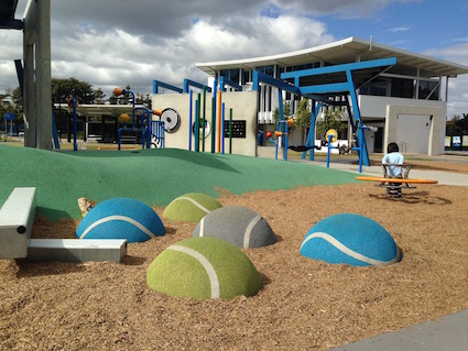
Not every playground has to be a fancy-schmancy one. Very often less is more. However when substantial amounts of public funds have gone into a play development, I do want to see the outcome and I expect that it will be more than the standard off-the-shelf playground kits. So when in Brisbane, nipping over to the Frew Park Arena play structure turned out to be not your run-of-the-mill playground.
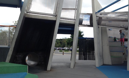
The first clue that this was going to be fun was in the official entrance – you could choose your path: the tunnel, the strips or the infinite mirror walk. Alternatively you could skirt around the arena and pop in at a couple of other places too.
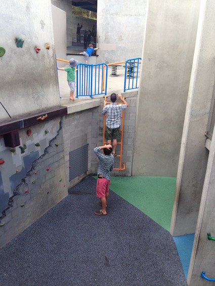
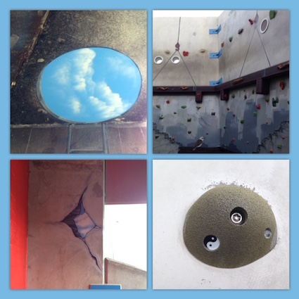
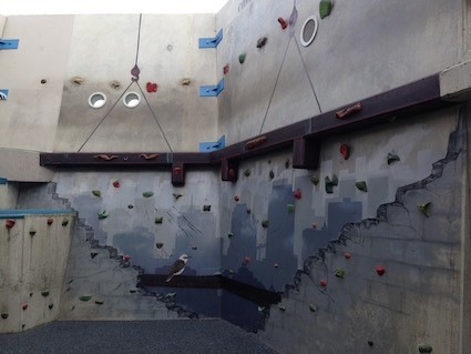
It was interesting and quirky. Like most things in life, attention had been paid to details that sets it apart from anything else I’ve seen. If you look at the photo below – you can see some of the murals – I know I missed several such as a tiny frog painted on top of a concrete tunnel. It’s hard to believe that that circle of sky and it’s surround is a lick of paint! Even the climbing holds were quietly funky – check out the yin yan symbol.
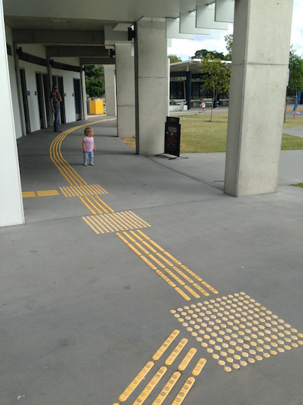
Around the periphery of the main park were all sorts of things in addition to a cafe and toilets. This pattern was on much of the ground – it’s a braille walkway. Children liked it and those on bikes treaded it like rumble strips and moved over it deliberately for the sensation.
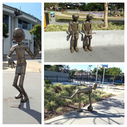
Bronze statues were also dotted about. These had references to by-gone times and the joys of coming to the site to dance, bowl and watch sport. The playground was built upon a former tennis arena and so the design reflects this in the height and concrete structures. The scale of the structures is immense. It was a place where international tennis tournaments and big name bands came to entertain.
The whole feel is a throwback to the Seventies but it’s been done in a back to the future sort of way. The playground feels bigger than what it actually is because there are tunnels, nooks, crannies, corners and cubbies (dens) all over the place. They invite you to explore and find out what’s round the corner.
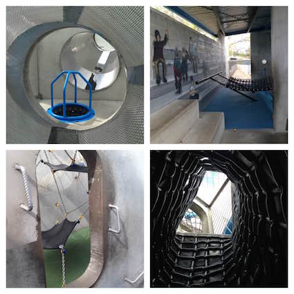
The place was designed principally to appeal to the 10-15 year old age range. However, as usual, this means that children under the age of 5 were all over it. I saw pre-schoolers everywhere. Because there was lots of choice in how you accessed the structures, the little children found ways in, and up, and through. Quite honestly, I do think playground designers underestimate the capabilities of children. I appreciate that there are guidelines and safety concerns to consider, but what I witnessed does make me wonder…
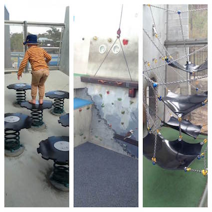
The photo at the top of this blog shows a child – who then proceeded to calmly and casually walk along the high beam below. He’d clearly done this lots before and his dad was not in the least bit phased by his behaviour. In fact what fascinated me about visiting many playgrounds lately is how much parents are facilitating children to explore at their level and trusting their offspring to get on and make this decision for themselves.
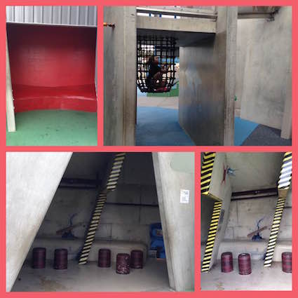
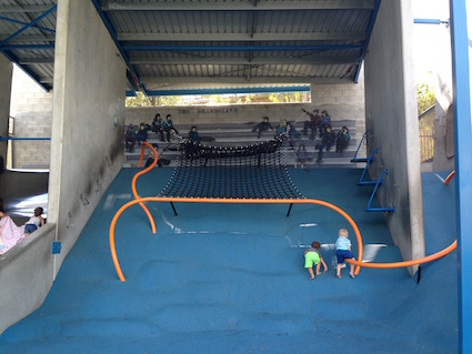
The safety features were integrated sensitively into the design. For example in the prison net below, it is quite easy to see if a child was in distress or unable to get out. In the control room, black and yellow paint added to the design so you didn’t need to be told to mind your head, it was obvious where to duck.
The arena had all sorts of features beyond the concrete mass. The whole place had high affordance: lots of possibilities for self-directed ways of using the equipment that relied on your interests, personal challenges and imagination.
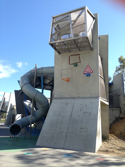
The choices available to children as they run, climb, hide, socialise and swing were clearly based upon how children like to play – the children and their parents whom I saw and spoke to really loved this park. They saw it as a great place to simply be. However it does beg the question, how much more fun would it be if loose parts were added… suddenly this would be a complete game changer
The Frew Park Arena was designed and constructed by local companies. The architects were Guymer Bailey in association with The Play Works and Brisbane City Council. The weblinks have lots more information and lovely photos. The cost was $980K AUD = £580K. It’s deliberately designed to be hardwearing and low maintenance. Not surprisingly it’s won several awards since opening in 2015. However, in an age where sustainability needs to be at the core of all that we do, will playgrounds like this need to become a thing of the past?
This blog post was originally published in August 2016.


